
PARC Principles
I first had my lecture on the PARC principles back in college, and again at the University Centre. They are extremely important as they are the basic priciples that underpin good design. But what are the PARC principles?
PARC stands for:
- Proximity
- Alignment
- Repetition
- Contrast
Proximity
When page elements are in proximity with one another, we call this a visual unit. Visual units create less clutter on a page, and gives structure to the information you are displaying. It also means that information is more likely to be taken in and remembered when in one, related visual unit.
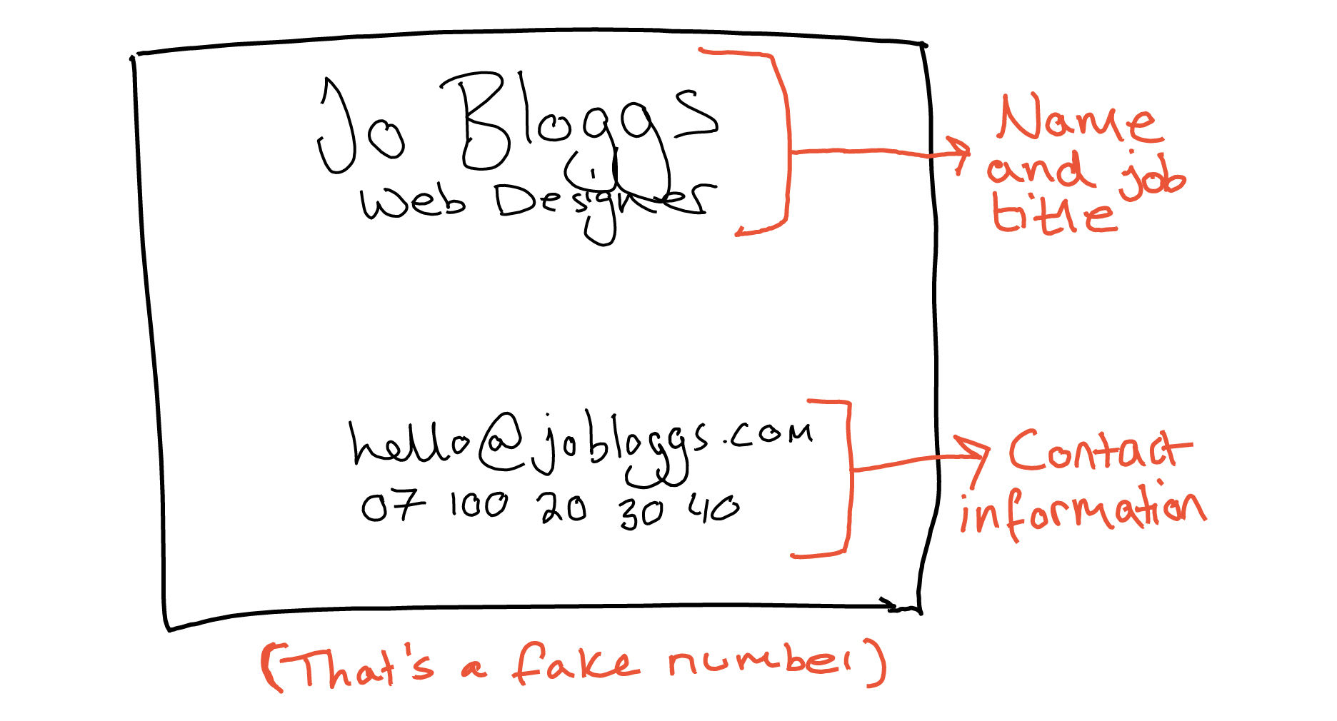
In design, related elements should be grouped together. For example, contact details on a business card would be one visual unit of related information.
Take a look at the example of business card below (drawn on my ReMarkable tablet). You’ll see that the name and job title is in one unit, whereas the contact information (email and phone number) is close together in their own unit, separate from the name and job title above it.
When starting out as a designer, it’s often tempting to fill out all the white space you can see. This is generally a bad idea, and presents as chaotic, messy and hard to take in information.
Do not fear white space. Use lots of it!
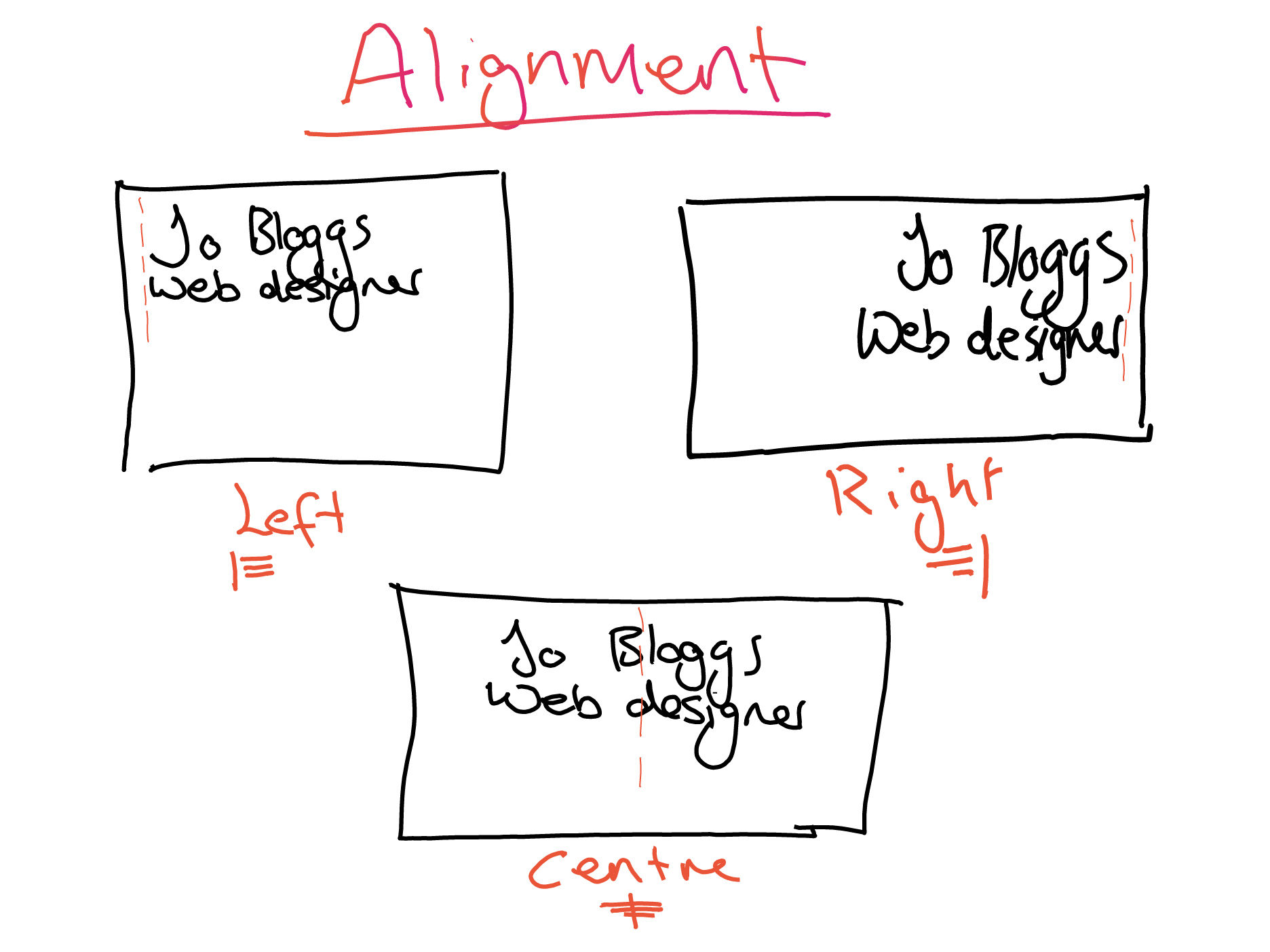
Alignment
Every element on the page should have a visual connection with another element, whether that’s an obvious connection (such as in a table) or a subtle one (invisible lines).
Elements should not be randomly placed. Visual disconnection is the biggest cause of unpleasant looking documents.
Use a grid when it’s applicable to do so, and always use strong alignments. I talked about alignments in my last post, Typography, so you can check that out for more. Spoiler: use left align.
There is one more alignment we need to talk about: justify. Justify changes the space between words to align the text to both edges of a text box. If you have too little text, you can create rivers where there are large gaps between words across multiple lines.
However, justify is also an academic formatting standard, and is used in print. It is not advisable to use in web though, because you have no control over how text will look across multiple font and screen sizes.
Repetition
The use of repetition across a website, document or other medium helps to unify a layout, and ensure consistency. Repetition can be obvious or subtle in the way that you use it. For example, a colour scheme repeated, a consistent header or the same fonts. In my website, I use the same gradient on links and highlights, and my navigation, hero and footer are always the same.
It’s important to note that using the same, consistent design builds trust with the user. Having a messy, unconsistent design is a sure-fire way to make a person doubt the legitimacy of your brand.
Contrast
This is mostly used to emphasise the difference between selected elements, and is created when two elements are very different. Contrast creates visual interest for the user and can be used in many different ways.
Have a look at the example I drew up below.
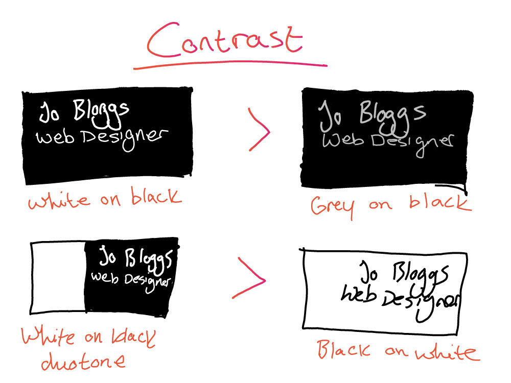
Contrast is required for accessibility criteria on the web, but you should also design with contrast in mind when designing in general, whether that’s in print or digital. There are many people who require good contrast, not to mention decent contrast in text just makes the thing more readable. Don’t use similar colours for text and background, and make sure that there’s plenty of contrast between text and the background. If you’re unsure, you can use any number of tools online. This tool by WebAIM will come in handy.
To Finish
Let’s wrap up then. Keep your design elements together by context, use strong alignments, make sure you are consistent and use contrast to increase readability and create visual interest. Oh, and don’t be afraid of the white space!
Those are the basics of good design. If you found this useful, please share this about!