Creating a gallery using mix-blend-mode
I recently made a gallery that uses mix-blend-mode and I wanted to share how I did it.
The first thing to note, is that the images are screenshots from Final Fantasy XIV. Some are from the latest expansion, Shadowbringers. If you play and haven’t gotten that far, there are things I’d consider spoilers for 5.0. You may not as there’s no context. It’s on you if you want to go ahead. 🤷🏻♂️

How it works
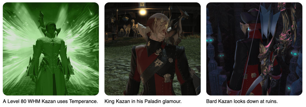
The gallery works so that when you hover on an image, a colour overlays it using `mix-blend-mode`. The colour (green, blue or red) is decided by what job (class) that image portrays. For example, my White Mage (WHM) is green, my Dancer (DNC) is red and my Dark Knight (DRK) is blue (just like the in-game roles).

Okay, so. The gallery is made in CSS Grid. If you don’t know Grid, it’s an amazing way of utilising CSS for… well… grid layouts. You should check out Rachel Andrew's or Jen Simmons‘ videos on it.
The grid adapts to your screen size. On my mac, it displays three columns. On my desktop, it displays four and on my phone it displays one.
Each grid item is a figure, with the class of healer, tank or dps. I applied a background colour for each class. Then, I add a blend mode of luminosity and an opacity of 80.
I added a white background to the figcaption because Chrome doesn’t display the same as Firefox. As of writing, I’m not sure why. I suspect it’s a grid thing, since the heights are different. 🤷♂️
Anyway, thats how I used blend mode to create a gallery with a colour overlay on hover. It could be used to replace the old ways of hovers, where you had to have a div display on top (which I used in my GCSE and is a div soup).
Have fun, and if you liked my content or found it useful, feel free to share on Twitter. 👋
