An introduction to typography
Hello World! One of the things I told myself I’d do, if I set up a blog, was to write up my notes from university and maybe talk about them. I think it’d be good to have a central place for all my notes, and if I can help anyone, then great! I’ll probably do each lecture as a seperate post, spread over time, so that I have plenty of time inbetween and have time for everything else I have going on.
The first thing I’m going to talk about is typography. So, let’s begin!
Typography comes from the Greek words typos and graphos, meaning form, and write. It is the practice of selecting, arranging and/or setting type. So, I guess you could see it as just messing with typefaces. But, what are typefaces?
Typefaces are designs of type. That’s it. There are tens of thousands of them in existence, and probably more. Two great resources for typefaces are Google Fonts, and Adobe Typekit.
Typefaces are often called fonts, which you will see just from the naming of Google Fonts. A font is a representation of a typeface in a specific size and style. For example, Raleway Light at 18px would be a font and Raleway would be a typeface. There’s no need to be snobby about it though. In fact, pretty much everyone refers to typefaces as fonts, so it’s probably just easier to give in and call them fonts at this point.
Taxonomies
There are several typographic taxonomies or categories of typefaces that are used. The simplest can be narrowed down to:
- Serif
- Sans Serif
- Script
- Blackletter
- Display
- Symbol
Serif has short, perpendicular strokes and originates from the 15th century.
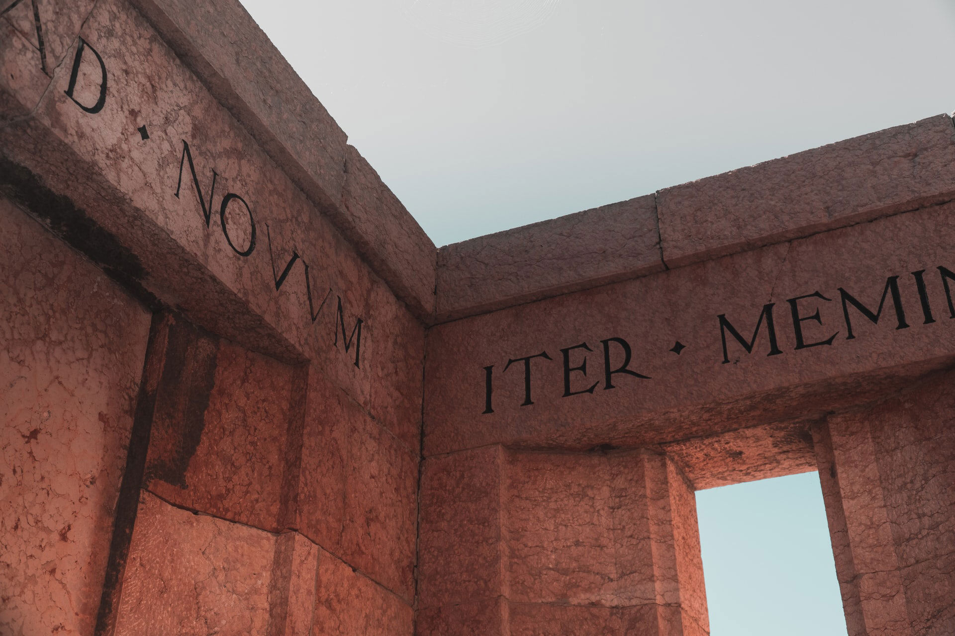
Sans Serif literally means without the serif strokes and comes from the 18th century.

Script is mimicked handwriting and is from the 17th century.

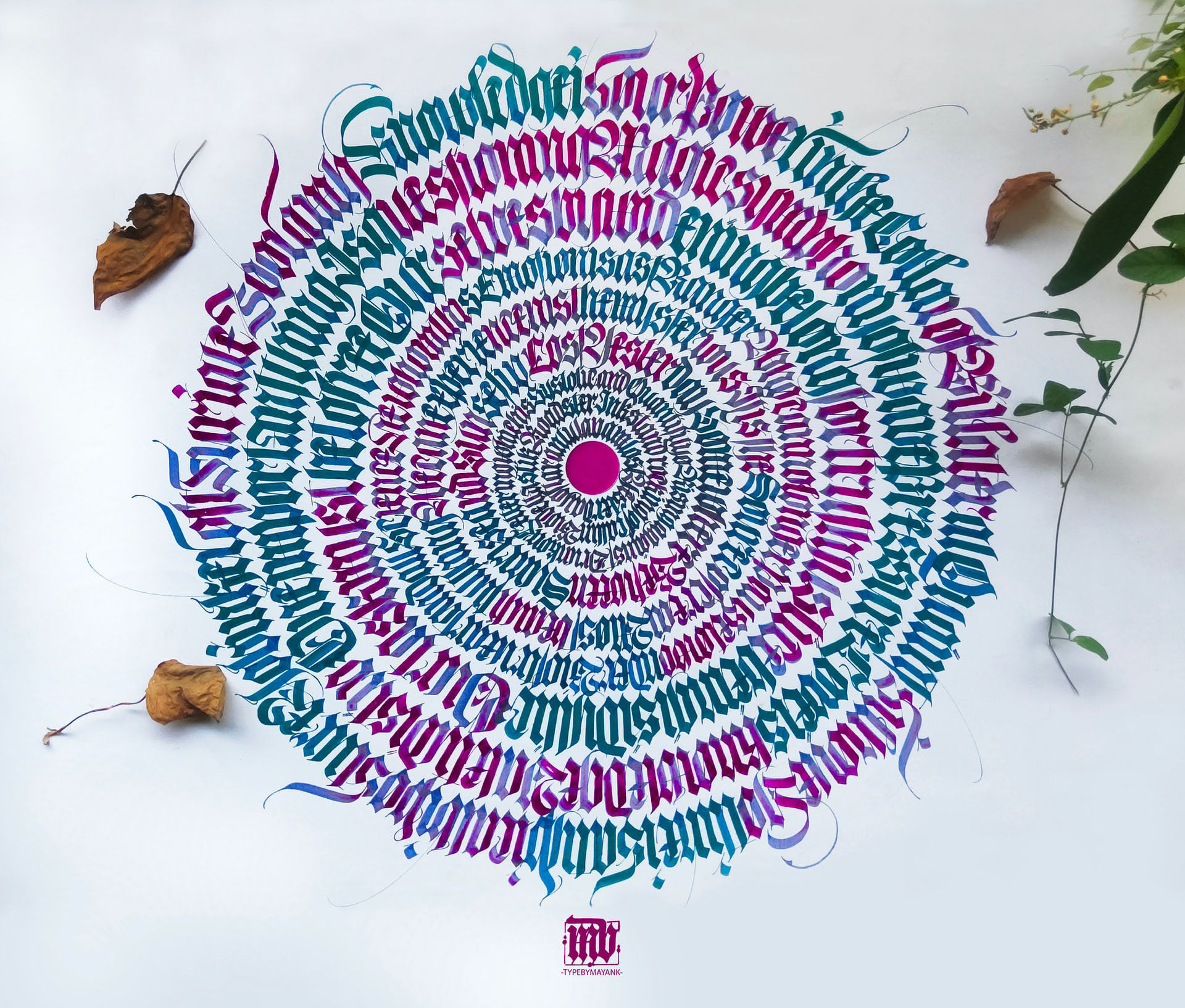
Blackletter is based upon medieval calligraphy. It was used in handwritten bibles. It is the oldest and comes from the 12th century. Think of it as Old English. You may also find it in churches, on gravestones and in stone inscriptions. Like this brightly coloured example:
Display typefaces are generally used in short headings rather than paragraphs, because they aren’t always legible at smaller sizes or in large chunks of text. They often have unique characters, are used minimally and can sometimes capture emotion.

Symbols are pictograms. If you’ve seen dingbats, you know what I mean. They’re illustrative. Please don’t use them in text.
It may be worth noting that some places (like Adobe Typekit) also have other categories, such as Slab, Mono and Hand.

Type Families & Weight
A typeface may have a number of specifically designed variations to lend emphasis to your text. These are called type families. Normally, you would have Normal/Regular/Roman as standard, Bold, Italics and maybe Oblique (similar to Italics, but not the same. Check out this old Stack Overflow answer.)
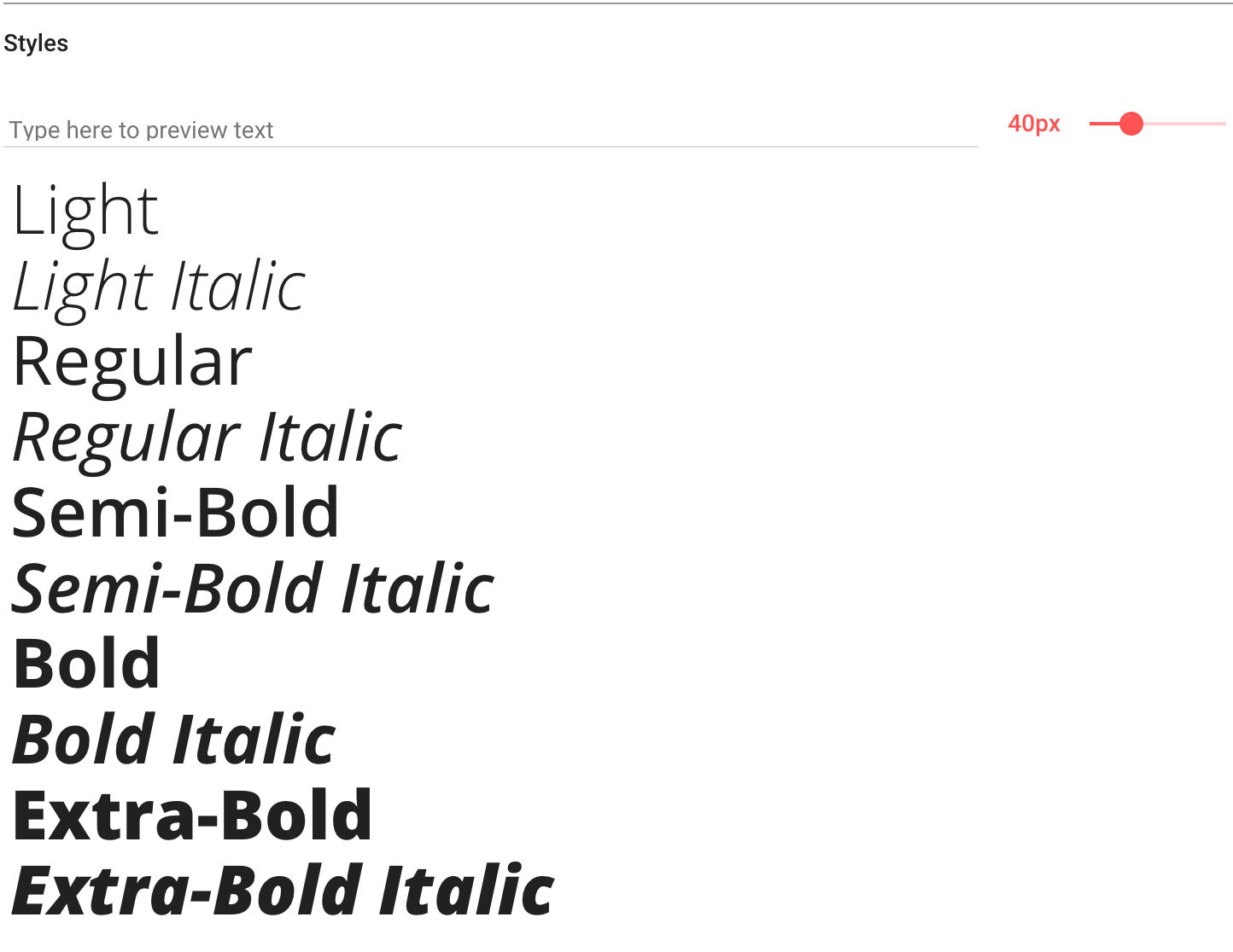
Now, type families often have more than the standard four (as you may well already know). This is the weight. The names of each weight are determined by the typographer who designed the typeface. This can drastically change the size of the family, and the price.
Often, you can find anything from ‘hairline’ or ‘ultra thin’ to ‘black’ and ‘ultra black’. Check out this screenshot of Google Fonts.
There are sometimes even further variations, where the typeface has been designed to be less wide or more wide. These are your usual condensed / narrow and extended / expanded / wide typefaces.
Measurements
When dealing with Typography, you can use a manner of measurements for the size.
If you work in print, you should use pt. The smallest reproducable size is 5.5 pt, and is often seen in newspapers. You should never go under this. Seriously.
If you’re a digital designer, you’ll work in px. As a web developer, you can use either, as well as em, rem and percentage.
CSSTricks has a really good article on these: https://css-tricks.com/css-font-size/.
Leading
Leading (pronounced led-ing) adjusts vertical space between lines of type. The name comes from when lead was traditionally inserted between metal type to create spacing.
You may see font size and leading presented together, such as 10/12pt. In this example, the 10 is the size of the type, and 12 is the size of the leading. Both are being measure in pt.
In web, however, we call leading line-height.
In professional publishing programs, such as InDesign, the autoleading feature is set as a default to 120% of the size of the type. On the web, I’d recommend a line-height of 1.5 or 150%, as it makes the text more readable, which is always a goal designers and developers should strive for.
It’s possible to have an inverse line-height but I’d very much recommend against it, as the characters will interrupt eachother. There may be cases for using it as decoration, or logos, but stay away for bodies of text.
If you have leading at 100%, then it is called solid leading. You still want to not do this, as the text becomes harder to read.
Leading at 200% is named double leading. Anything between solid and double is expressed with a numerical value.
Alignment
Horizontal alignment is very important to consider, so we’re going to cover the four of them.
Left alignment is the default in western culture and with languages that read left to right (LTR). We want to use this almost always for legibility. It’s the strongest alignment for us.
Right alignment is used with languages that read right to left (RTL). Unless you’re designing for those languages, it’s probably best to stay away unless there’s a need for it (in my opinion).
Centre align is great for headings, captions, very small paragraphs and stylised design of text (like poetry). However, we shouldn’t be using it for large bodies of text.
Justified alignment squares off the body of the text, by adding extra spacing between words. The best example I have here is in academia, where papers and assignments are typically required to use justify. However, it really is easy to get wrong, as large gaps can appear between words and lines, called Rivers. This looks horrendous and we need to be careful to avoid that.
To Finish
To wrap up, typography is great. I was in the year at university where the typography module was taken out of our specification, so I missed that. What you’ve read so far is a lecture I was given regurgitated back at you.
If you want to read more, I’d recommend ‘Typographic Style Handbook’ by Mitchell & Wightman. It contains lots of useful information, for many scenarios and looks great.
Remember: people often don’t see good typography, but they will see the bad.
